
SimScren and Sim Monitor Editor
To start the SimScreen and Sim Monitor editor, double click the SimScreen Editor icon that has been created on the Desktop during the SimDash installation.
Leave the simulator and SimDash running in the background if you want in-game data to be displayed while creating or editing a SimScreen design.
The main user interface is composed of four major sections, as shown in the picture below:

- 1: The buttons in this toolbar are used to open, save or start a new design. There are also buttons to copy, cut or paste objects in the current design.
- 2: Clicking the buttons in this toolbar, a new object corresponding to the clicked buttons is created in the design area. There are five type of objects (also called widgets later on) that can be added to the current design, and each one represents the associated data in a different way. We have, from left to right in the toolbar: the Image widget, to add a picture to the current design. The Gauge Widget displays a gauge. Next are the Text, the Chart and the Bar Widgets. More details on each widget type will be given later on.
- 3: This is the main editing area. Widgets can be added, removed or their positions/size changed.
- 4: This is the Properties panel. It displays and allows you to change the properties or the currently selected widget. Clicking an empty point on the editing area (3) the Property panel will display properties that affect the global design, not the single widgets.
Design Properties
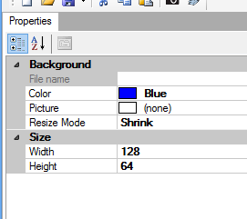
To display the properties associated to the design being edited, click any point in the editing area which is not covered by a widget. The Properties panel on the left hand side of the application will populate like in the picture above. This is a list of the displayed properties and their meaning:
- File name: The name of the backgroud picture. This property is read-only.
- Picture: To select the background picture, click and select the file. If editing a design for the SimScreen, the background picture should use only black and white colors. If instead the design being edited is for the Sim Monitor application, there are no limitations on the number of colors used. To remove the background picture, select the value of this property and press the CANC key. For best results, use a background picture with size equal the size of the design (see below).
- Resize mode: if set to Shrink the background picture is stretched to cover the all display, even if it is smaller or bigger. The RealSize value means the picture is displayed without resizing, so if its size is smaller of the size of the display it will cover only part of the background. If the picture size is bigger than the display, only part of the picture will be shown.
- Width and Height: This is the size of the design. If the current design is for the SimScreen, the size must be 128×64, otherwise it won’t be displayed. With the Sim Monitor used with an external monitor, you can set any size for the design, but probably you want the size to be equal to the resolution of the monitor used to display the design. Lastly, the USBD480 display requires a resolution of 480x272. #an error message will be shown on the display if the size of the design is wrong.
Properties common to all type of Widgets
The following is the list of properties that are present in each type of widget:
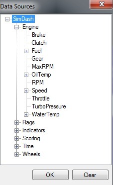
- Data source: this property is very important and will be used very often. The data source of a widget is the data item that will be displayed. It can be the speed of the car, the gear position, the current lap time and so on. To select a data source, click the property and select the desired data item from the dialog. To remove the data source from a widget, open the data sources dialog again and click the Clear button.
- Rotation: change this property to rotate the selected widget. Allowed values are 0, 90, 180 and 270 degrees.
- Height, Width, X Position, Y Position: the size and position of the widget. This values can also be changed selecting the widget with the mouse and dragging it around the editing area.
- Level: this value is used when two widget are placed one on top of the other. The widget with lower value of the Level property is drawn first.
Image widget
The Image widget is used to add a picture to the design. It works clicking the widget icon in the toolbar and selecting the desired picture. If the current design must be displayed by the SimScreen, the selected picture must be black and white. With the Sim Monitor application and Sim Monitor for USBD480 there is not such limitation.
The Image widget can be used in six different ways:
Mode 1
To add a static picture to the design. Static means the picture doesn’t change over the time but stays always the same. The picture could represent a logo or a frame around a region of the screen. The Mode property of the picture is set to Standard.
Mode 2
To add an animated gif. An animated gif is a picture format where the image is composed of multiple frames, which are displayed in sequence. To create an animated gif we usually create the single frames first and save them as gifs. Then we use Easy Gif Animator to put the frames together and create the animated gif. But there are other free tools and also online tools that allow you to create and animated GIF from the individual frames. The Mode property of the picture is set to Standard.

Mode 3
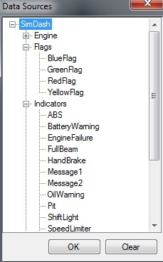
Add an animated gif and link it to a data item which can assume the values 0 or 1. These data items can represent the state of warning lights (such as the shift light, the hand brake or the battery lights) or whether any flag is active during the race. As I said the value of these data items are either 0 or 1. They are grouped together in the Data Sources dialog under the Flags or Indicators categories:
I will give an example here: suppose I want to display the battery icon when the battery warning light is ON.

First thing I create an animated gif composed of two frames: the first frame is empty and the second frame displays the picture of a battery. Also, the value of the BatteryWarning data item is 0 when the light is OFF and equals 1 when the light is ON. We are going to display the first frame (empty in this case) when the battery warning light is OFF (BatteryWarning is 0) and display the second frame (battery icon) when the warning light is ON (BatteryWarning is 1). These are the required steps (some properties will be explained later on):
- Add the animated gif to the design, clicking the Image widget icon in the toolbar.
- Click once the just added image widget so it becomes selected.
- Set the Mode property to Standard
- Set its data source to BatteryWarning.
- Set its Max value to 1 and its Min value to 0.
Now the first frame of the animated gif is displayed when BatteryWarning = 0 and the second frame when BatteryWarning = 1.
Mode 4
Add an animated gif and link it to a numeric data item which can assume continuous values, not just 0 and 1. Example of such data items are the speed, the gear position, the rpm or tyres temperatures. The animated gif usually displays some sort of progress bar, like the example below:

Each frame of the animated gif displays a different state of the progress bar.
This is an example of use: suppose we want to use the progress bar above to represent the engine RPM value (it is again an animatd GIF). This is what we are going to do:
- Add the progress bar animated GIF to the design, clicking the Image widget icon in the toolbar.
- Click once the just added image widget so it becomes selected.
- Set the Mode property to Standard
- Set its data source to RPM.
- Set its Max value to the maximum value of RPM (could be 9.000, 10.000 or 11.000 for example)
- Set its Min value to 0.
Now the progress bar will change the displayed frame based on the value of the RPM data item.
Mode 5
To display the first or the second (or third) frame of an animated gif, based on whether a certain condition is satisfied or not. This could be useful for example to show a warning icon when the fuel level is below a threshold value. These are the steps that must be performed to configure the widget:
- Click the Image widget icon to add an animated gif composed by two (or three, see later) frames to the design.
- Click the image you have just added to the design, so it becomes selected.
- Set the Mode property to Threshold
- Set the data source (for example set it to Fuel in litres)
- Set the Comparison property to the type of comparison you want to perform. Allowed values are Equal, Less than, Greater than (for example set it to Less than)
- Set the Compare value property to threshold value (for example the value 5)
- If Alternate picture is set to TRUE, the SECOND and THIRD frames are displayed when the test condition is satisfied. When the Alternate picture property is set to FALSE, only the second frame of the animated gif is displayed when the test condition is satisfied.
- The Time interval property is the interval in ms (milliseconds) before the displayed frame is swapped between the SECOND and THIRD frame, when the test condition is satisfied.
Mode 6
The last mode is code Rotation. The Rotation mode allows you to rotate an image based on the value of the associated data. This is useful for example if you want to create a very good looking gauge, with a nice pointer (needle). The pointer will be created using an image that then we will make rotate based on the value of the associated data. To make an image rotate, configure the image widget as follow:
- Mode: set to Rotate
- Min Data Value: the minimum value of the associated data. if the associated data is RPM, for example, the minimum value probably is 0 (RPM)
- Max Data Value: the maximum value of the associated data
- Min Data Rotation: how much the image must be rotated when it is displaying the minimum value. Negative values will rotate the picture anti-clockwise
- Max Data Rotation: how much the image is rotated when it is indicating the maximum value
- Rotation Center X and Y are the coordinates of the point (within the picture) around which the image is rotated. (0,0) is the top-left corner of the picture.
Following is the list of properties that can be changed when a Image widget is selected:
- Max: the maximum value of the data source item.
- Min: the minimum value of the data source item.
- Size Mode: if set to ResizeToFit, the picture will be resized to match the size of the widget, otherwise it will displayed without resizing.
- Action: this property only works with the Sim Monitor application. It won’t work with the SimScreen. It’s the action to perform when the Image Widget is clicked. Options are: move to next or previous design or move to design number 1 to 20.
Gauge Widget
Gauge Widget is available in a basic and an advance versions. The basic version gauge looks like in the picture below:
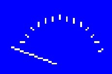
and is the default mode of the gauge widget when it is added to the design. The advance version offers more possibilities for customization, as explained later.
The properties of the gauge widget are:
- Color: the color of the widget. With the SimScreen, this property must be set to White.
- Draw ticks: set to FALSE is ticks should not be drawn.
- Min/Max: the minimum and maximum values of the data source item associated with the widget.
- Gauge type: to change the widget version (Basic or Advance).
The following properties are working only when the widget version is advance:
- Needle length: the length of the needle. Valid values are between 0 and 1.
- Radius: the sweep of the needle, in degrees. If the value is negative, the needle will move clockwise. Anti-clockwise otherwise.
- Start: the position of the needle in degrees, when the gauge is set to its minimum value.
- Thickness: thickness of the needle.
- Ticks Every: the space (in degrees) between one tick and the next one.
The gauge widget in Advance mode allows you to create reasonably looking gauge pointers.
Text Widget
The Text Widget displays either a fixed text or the value of a data item, if its Data Source property is set. Relevant properties are:
- Color: color for the displayed text. With the SimScreen this property must be set to White.
- Horizontal/Vertical Alignment: the alignment of the text.
- Auto Resize: is set to TRUE, the widget is automatically resized to contain all the text.
- Font: the font used to draw the text.
- Text: the text to display. This value has effect only if no data source is set.
- Format: to change the way the data item is displayed. It can be used to add a static string before or after the data item value (try for example: Speed: {0}) or to set the number of decimal figures (try {0:###0.00}.
- Alternate Color: when this feature is enabled, you can specify an alternate color for the text. The alternate color will be used when the specify condition is true. For example, the RPM value becomes red when it is higher than 8.000
- Change Background Color: Similarly, the background color of the text widget can be changed when the associated data is equal, below or above a specified threshold. Normally the background color is transparent.
- Blinking: Text can also blinking, when the associated condition is true. The Speed parameter specify the blinking speed, in milliseconds. Text could be blinking when RPM are too high or fuel too low, for example.
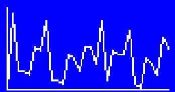
Chart Widget
The Chart Widget displays how the value of a data item changes over the time.
There are four possible values for the Chart Type property:
- Bars: values are represented with vertical bars. There is no empty space between one bar and following one. The width of the bars depends on the value of the Number of Points property (see later).
- Lines and ExtraLines: values are represented by connected lines, like in the picture above. ExtraLines adds vertical lines connection the value points to the X axis.
- ManualSetBars: the values are represented with vertical bars but it is possible to specify the bars with and the space between bars.
Other relevant properties for this widget:
- Color: the color of the chart. With the SimScreen the value must be White.
- Auto Scale Min and Auto Scale Max: whether the MIN and MAX values of the Y axis should be automatically set to match the minimum and maximum values of the displayed points.
- Space Between Bars: as it says. Only works when Chart Type is set to ManualSetBars.
- Bar Width: only works when Chart Type is set to ManualSetBars.
- Draw Axis: set to TRUE to draw the axis.
- Min and Max: The minimum and maximum values of the Y axis. Only work when Auto Scale Min and Auto Scale Max are set to FALSE, respectively.
- Sampling Interval: The interval of time in ms between one point and the following.
- Number of point: Number of point on the X axis. This only works when Chart Type is not set to ManualSetBars. In that case the number of points depend on the width of the bars and the space between them.
- Add only new values: Add a new point is added to the chart only if its value is different from the last point added.
Bar Widget
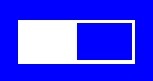
The Bar Widget display a progress bar that moves based on the values of the associated data. The relevant properties are:
- Color: Color of the widget. With the SimScreen, color must be White.
- Min and Max: the minimum and maximum values of the data item associated with the Bar Widget.
- Show Border: whether to show the border of the progress bar or not.
- Invert Colors: whether to invert the fore and back colors of the widget.
- Mode: the bar can move from left to right, right to left, bottom to top, top to bottom, from the center to sides or from the center to the top and bottom.
- Alternate Color: The alternate color is used when the specified condition is true.
Circle Widget
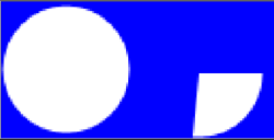
The circle widget has two modes: Circle and Arc.
The color of the circle widget is normally the one specified for the Color property. But if Alternate Color 1 or Alternate Color 2 properties are enabled and the data associated to the widget satisfies the properties' conditions, then the alternate color is used.
The Alternate Color 1& 2 features include these properties:
- Enabled: if FALSE, the alternate color is never used, otherwise it will be, if the associated condition is true.
- Alternate Color: the alternate color to use when the condition is true
- Comparison and Compare Value: these two properties specify when the alternate color should be used: for example when RPM > 6000
The widget can blink when the Blinking feature is enabled and the data associated to the widget satisfies the specified condition. The color changes between the current color (Color or Alternate Color 1 or Alternate Color 2) and Color.
In Circle mode, the widget is displayed as a simple circle and its color changes between Color, Alternate Color 1 and Alternate Color 2 based on the value of the associated data. This widget in Circle mode was designed to simulate an led associated to RPM: Color represents the LED when it is off (black or grey). Alternate Color 1 is the color of the led when it switches ON. Alternate Color 2 is used when the RPM value is high. Blinking could be used when the value is even higher. In this example the rev lights are implemented using Circle Widgets.
In Arc mode, everything said for the Circle Mode is still valid (colors and blinking) but the widget is displayed as a solid arc, and the sweep angle depends on the value of the associated data.
- Arc Start Angle: the starting position of the arc (in degrees) when the associated data is at the minimum value
- Arc End Angle: the end position of the arc (in degrees) when the associated data is at the maximum value
- Data Min and Max: value of the associated data when the arc is at the Start or End position.
The Arc Mode is useful to create a rev bar similar to the one in this example: the yellow rev bar that follows the RPM pointer is made with a circle widget in Arc Mode. The arc starts at position 0 RPM and "opens" following the RPM pointer when the RPM value increases. The Circle widget is behind a gauge picture with transparent areas that show the yellow circle widget behind.
Rectangle Widget
The Rectangle Widget displays as a rectangle. It was designed to simulate rectangle an LED for RPM or warning lights. It's shape never changes but the color does, based on the value of the associated data.
- Color: is the default color of the rectangle.
- Alternate Color 1 & 2: alternate colors that will be used if the associated condition is satisfied by the data associated to the widget. For example RPM value is high or a warning indicator is on.
- Blinking: is this function is enabled and the associated condition is true, the color of the rectangle will change between the current color (Color, Alternate Color 1 or Alternate Color 2) and Color. Speed is the blinking speed, in milliseconds.
When using the rectangle widget as an LED, Color is the color of the LED when off (black or grey probably). Alternate Color 1 and Alternate Color 2 are used when the data is high and very high. In this example we used the Rectangle Widget to simulate RPM leds. Their color changes based on the RPM values and also blink when RPM are high enough.
The rectangle widget can also be used to simply display a static rectangle on the screen, with no associated data.